
My Pitch Deck Experience
I have made hundreds of iterations of pitch decks over the course of building my company. Those decks have helped me win hundreds of thousands of dollars in non-dilutive funding, perform well in pitch competitions, and move investors through the fundraising process for the seed round my company is currently finishing.
Over time, one of the biggest things I have learned is that there really is not one “pitch deck.” You should have two different versions of your deck, because a presentation and a document someone reads on their own are doing two completely different jobs.
The first is your presentation deck. This is the deck you actually stand in front of and pitch. The second is your read-through deck, which is the version you send in emails, upload to investor portals, or share with someone who may look through it before ever speaking with you.
I honestly think the read-through deck is just as important as the presentation deck, and in some cases it may be more important. Your presentation deck only matters once you are already in the room. Your read-through deck is often what determines whether you get into the room in the first place.
The Two Different Decks
Your presentation deck should usually be shorter, cleaner, and much less wordy. It should have more white space, larger visuals, fewer competing elements, and enough information to help someone follow the story without forcing them to read paragraphs while you are speaking. The slides are there to support your voice, not replace it. I find it easiest if you make the read-through deck first, and then take stuff out to make a presentation deck.
Your read-through deck needs to do more work on its own. It still should not be overloaded with text, but it needs enough information for someone to understand the company without a narrator explaining every slide. A reader should be able to understand your core value proposition, the problem, the solution, market opportunity, traction, team, business model, and what you are raising without ever hearing you speak.
For example, my competitive matrix in a read-through deck is considerably more detailed than the one I would use while presenting. During a pitch, I only need to make the core differentiation obvious. In the read-through version, I can include enough detail for someone to actually understand how the company compares across several dimensions.
If you want a deeper breakdown of how I structure the actual presentation version, you can read my How to Win a Pitch Competition guide. The rest of this article focuses primarily on the read-through deck, because that is the version most founders will send around the most.
Creating the Deck Itself
Creating a pitch deck you actually like can be surprisingly difficult. I have personally never hired someone to build mine, and as a result, some early versions were honestly pretty ugly. There is nothing wrong with using a freelancer or designer if you have the budget, especially if design is not your strength, but I also do not think you need to spend a lot of money to make a deck look professional.
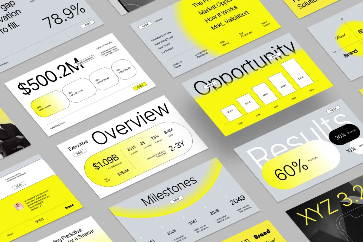
What has worked best for me is simply studying decks in the industry I am building in and borrowing the design language that already fits that space. Search something like “[your industry] pitch deck” and pay attention to the recurring fonts, colors, image styles, spacing, shapes, and overall layout. You are not copying the company’s content; you are using existing decks as references for what visually feels credible in that category.
Different design choices can also create very different impressions. For example, whites, light blues, and cleaner layouts often feel more clinical, polished, and medtech-oriented, while black backgrounds, darker colors, and gradients can create a more futuristic or technology-heavy feel. The right choice depends on the company and the story you are trying to tell.
Most importantly, iterate and test. My decks have improved through hundreds of small changes rather than one major redesign. Show them to people, notice which slides feel confusing or visually crowded, and keep improving them. Over time, you start to understand what works for your company, and the deck begins to look much more polished without needing to pay someone else to build it.
How I Structure a Read-Through Pitch Deck
There is no single perfect slide order for every company, but this is the general structure I have found works well. You can move sections around depending on your company, but every slide should help answer one of the basic questions someone has when they first encounter your business.
1. Start With an Overview Slide
I like to give the reader a snapshot of the company before making them work through fifteen slides to understand why they should care.
The overview slide should include a very short two- or three-sentence explanation of what the company does and the names and photos of key team members or advisors and, when useful, logos from companies, universities, or organizations that help establish their background.
Then include no more than roughly five to seven one-line traction points, with specific metrics bolded and emphasized.
For example:
$100K in non-dilutive funding
90% patient adoption intent
These should be the strongest things you can say about the company, not every accomplishment you have ever had. If your team has successfully exited companies before, say it. If you have raised meaningful funding, say it. If you have patents granted, major customers, strong revenue, clinical progress, major partnerships, or significant technical milestones, say it.
The goal is that someone can look at the first slide for thirty seconds and immediately understand both what the company is and why it may be worth continuing to read.
2. Explain the Problem
I would generally use one or two slides to explain the problem. Do your best to tell a story rather than simply listing statistics.
Who experiences the problem? How often does it happen? Why does it matter? What is the financial, emotional, operational, or clinical consequence? Use metrics wherever you can, but make sure the metrics are actually helping the reader understand the scale or severity of the problem.
This is also a good place to introduce shortcomings with existing solutions. You do not necessarily need a full competitive matrix yet, but the reader should begin to understand why the status quo is not good enough.
3. Introduce Your Solution
Once the problem is clear, spend one or two slides showing how your company solves it.
The first solution slide should be simple. What is the product or service, and what does it allow the customer to do that they could not do before? Then, if necessary, use a second slide to explain important features, technology, workflow, or differentiation.
Try not to turn this into an engineering diagram unless the technical detail is genuinely necessary to understand the value proposition. The reader should come away understanding why the solution is better, not simply that it is technically sophisticated.
4. Show Market Validation
For early-stage companies, customer validation can be some of the most valuable traction you have.
This slide can include customer discovery results, survey findings, pilot feedback, letters of intent, customer testimonials, interviews, waitlist data, or other evidence that the market actually cares about what you are building.
Do not just write that you interviewed fifty customers. Tell the reader what you learned from those conversations. If 80% of customers told you they would prefer your approach, show that. If physicians repeatedly identified the same problem, explain it. If a customer quote captures the value proposition better than you can, include it.
The goal is to show that the problem and solution are not assumptions that only exist inside your head.
5. Intellectual Property Overview and Strategy
If IP is important to your business, include a slide explaining where you stand.
This does not need to contain the entire patent strategy or every claim you have filed. It should give the reader enough information to understand what is protected, what has been filed or granted, and how the IP supports the company’s competitive position.
Depending on your company, this may include patents, pending applications, continuations, international filings, trade secrets, proprietary datasets, or other forms of defensibility.
If IP is not meaningful to your company, there is no reason to force an IP slide into the deck.
6. Traction
Your traction slide should bring together the most meaningful evidence that the company is moving forward.
Depending on your stage, that may include revenue, users, pilots, partnerships, funding raised, non-dilutive funding, patents, technical milestones, regulatory progress, prototypes, customer discovery, or other meaningful validation. Use the slide to show a pattern of de-risking and forward progress.
7. Market Size
Explain the size of the opportunity and how you calculated it.
This is where TAM, SAM, and SOM can be useful, but do not simply throw three enormous numbers onto the slide without explaining where they came from. The reader should be able to understand who your initial customers are, what you could realistically serve first, and what the larger market becomes if the company succeeds.
You can also use market analogues or comparable companies to give context. If similar products have generated significant revenue, licensing deals, or acquisitions, those comparisons can help someone understand what success in your market looks like.
Depending on your business, you may also place high-level revenue projections on this slide rather than creating a completely separate projections slide.
8. Team
Your team slide should answer a simple question:
Why is this group capable of building this company?
Include the core team first, then the advisors who actually matter. Focus on the experience that is directly relevant to what you are building. Prior exits, capital raised, industry experience, technical expertise, regulatory experience, customer relationships, or previous companies can all be meaningful.
Logos can be useful here because they allow someone to quickly recognize prior employers, universities, or companies without forcing the slide to become text-heavy.
9. Go-to-Market and Revenue
Use one or two slides to explain how the company actually makes money and how the product gets into the hands of customers.
Who pays you? How much do they pay? How do you reach them? What is the sales process? Is the business direct-to-consumer, enterprise, licensing, subscription, reimbursement-driven, marketplace-based, or something else?
Then give the reader a reasonable sense of how the business could scale. You can include high-level revenue projections if they are useful, but early-stage projections should be treated as a model of how the business works rather than a promise that you will generate exactly $27.4 million in Year 5.
10. Regulatory or Development Pathway
For regulated, technical, or science-based companies, investors need to understand what has to happen before the product reaches the market.
Show the major milestones, approximate timeline, and major regulatory or development steps. You do not need to reproduce an entire regulatory strategy, but the reader should understand whether you are six months from launch or six years away and what needs to happen between now and then.
For companies without a meaningful regulatory pathway, you can obviously leave this out.
11. Competition
I generally like to include a competitive slide or matrix toward the later part of the deck, once the reader already understands the problem and your solution.
Show the alternatives customers use today and the dimensions that actually matter. Do not create a matrix where your company magically has a checkmark in every column and every competitor has an X. That usually looks engineered to make you win.
Pick the factors customers genuinely care about and explain why your approach is differentiated.
Your read-through version can be more detailed here than the presentation version. In a live pitch, I might simplify the matrix to a few critical dimensions. In the deck I send to someone afterward, I want enough detail for them to understand the competitive landscape on their own.
12. End With the Ask
If you are fundraising, clearly state how much you are raising, how much is already committed if appropriate, and what the capital allows you to accomplish.
The best ask slides connect money directly to milestones. Instead of simply saying “Raising $1 million,” explain what that $1 million gets the company to.
For example
Raising $1M to complete product development, launch our pilot, hire two key team members, and reach our next regulatory milestone
A Gantt chart can be especially useful here if your company has a longer development timeline or several milestones happening in parallel. It lets investors quickly see how the funding maps to major activities, when those activities are expected to happen, and what the company should accomplish by the end of the raise
That gives the investor a reason for the number and makes the use of funds feel much more concrete.
Your Deck Is Not Supposed to Tell Them Everything
One of the hardest things about building a pitch deck is deciding what to leave out.
Your goal is not to answer every possible question someone could ever have about the company. That is what diligence, follow-up calls, and additional materials are for. Your goal is to give someone enough information to understand the opportunity, believe you have made meaningful progress, and want to continue the conversation.
That is why I think having two decks is so important. Your presentation deck should help you tell the story. Your read-through deck should be able to tell most of that story without you.
The Biggest Takeaway
I have rebuilt my decks hundreds of times, and I still make changes constantly. As the company evolves, the story changes. New traction becomes more important, old accomplishments become less relevant, investor questions reveal where the explanation is weak, and sometimes one small change in slide order makes the entire company easier to understand.
Do not treat your pitch deck as something you make once and finish. Treat it as a living document that improves every time you pitch, send it to someone, or get a question you should have answered more clearly.
Most importantly, remember the difference between the two versions: your presentation deck supplements you, while your read-through deck has to stand on its own.